BACKGROUND
Justbc
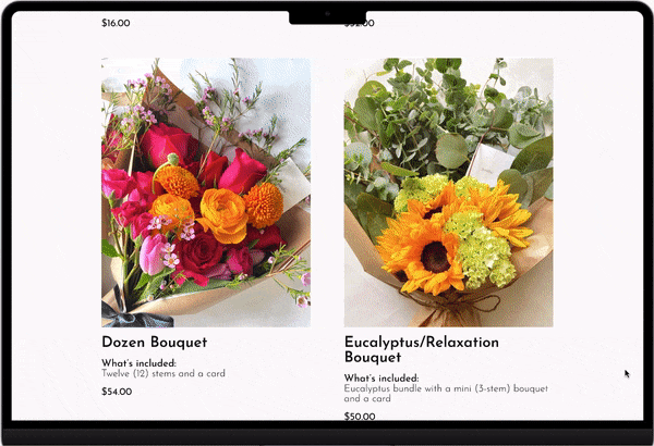
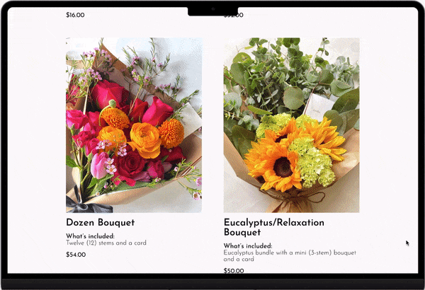
Opened in 2021, JustBc is a local floral business located in New Orleans, Louisiana. JustBc specializes in freestyle bouquets with each bouquet uniquely designed with hand-picked flowers. None of the bouquets are ever the same. The element of surprise is what makes each client’s experience unique and special just like their bouquets. Currently, JustBc provides appointment-based services and local delivery for clients around the New Orleans area. In the near future, JustBc hopes to expand their business to provide services to clients beyond New Orleans.
SOLUTION
A one-stop online shop
Roles
Product Designer
UX Researcher
UX/UI Designer
Usability Tester
Tools
Figma
Miro
Duration
2 weeks
OVERVIEW
ROLES AND RESPONSIBILITIES
Roles and Responsibilities
Roles
Product Designer
UX Researcher
UX Designer
Usability Tester
Tools
Figma
Miro
Duration
2 weeks
1.Empathize
2.Define
3.Ideate
4.prototype
5.test
PROCESS
DESIGN THINKING
Design Process
1.Empathize
2.Define
3.Ideate
4.prototype
5.test
PROBLEM
CUSTOMERS ARE ONLY ABLE TO Place orders on justbc's instagram profile.
Currently, JustBc accepts floral bouquet orders that are placed on Instagram through direct messages. This limits their customer-based to mostly existing Instagram account holders. The business does accepts orders through direct text messages and emails; however, only if potential customers get a hold of their business cards shared by previous customers.
A gallery to showcase work
-
Highlight JustBc's unique freestyle hand-tied bouquets designs.
-
Organize designs based on seasons.
-
Educate customers of what florals are seasonally available.
-
Increase customer's reassurance of high quality designs with realistic photos.

Simple selections to choose
-
View what JustBc has to offer without opening so many tabs.
-
Know everything that is included with ease.
-
Simple design for minimal distractions.
-
Feel confident at the start of the order process.

Straightforward process
-
Know exactly what the fees are from the start.
-
Check your preferred delivery date in advance.
-
Input all the important details with ease.
-
Submit the order with confidence and less stress.

COMPETITIVE AND COMPARATIVE ANALYSIS
Direct competitors heavily relied on instagram as part of the user experience.
Although 2 of 3 direct competitors had a website, Instagram played a large role in the user experience by having customer preview their design on their Instagram account before placing orders through their website or Instagram’s direct message. This would limit the experience for potential customers who may not have access to an Instagram account.
The indirect competitors provided much more variety and options. However, their website experience was too overwhelming with unrealistic references of their floral arrangements and designs.

USER INTERVIEWS
CURRENT CLIENTS WANT THE ABILITY TO REFERENCE DESIGNS, CALENDAR AVAILABILITY, AND PRICING IN THE MOST CONVENIENT WAY POSSIBLE.
I interviewed 4 current clients of JustBc to understand their experiences with placing orders for floral bouquets with JustBc and their overall experiences with other floral businesses. Questions were asked to find patterns of online ordering process, understand their overall experiences with JustBc, and identify what motivates them to continue business with JustBc over other floral businesses. The data was synthesized through thematic analysis then grouped by needs, pain points, wants, and motivations.
SURVEY
general users want user-friendly websites with simple ordering processes.
I collected 11 surveys to understand general users’ experiences with placing orders or browsing with the intent to place orders for floral bouquets online. Questions were asked to find patterns of online ordering process, understand their overall experiences with their preferred online floral business, and identify what motivates them to continue or discontinue business with floral businesses. The data was synthesized through thematic analysis then grouped by process, good experiences, suggested improvements, and discontinued support.
KEY TAKEAWAYS
GOOD COMMUNICATION, TRANSPARENCY, AND ACCOMMODATION ARE IMPORTANT FOR USERS.
Overall, users are more likely to continue placing orders with a business that provides an easy and seamless online experience that utilizes simple processes while also giving enough opportunities for order customization as well.
The online experience should include:
-
Excellent customer services (online and off-line).
-
Realistic references and clear expectations of product and prices.
-
Businesses’ willingness to accommodate for users’ requests (i.e., delivery instructions, designs, and personalized messaging).
USER PERSONA
Meet JAmie Le, Your executive assistant who's love language is gifting floral bouquets.
After synthesizing my data from interviews and surveys, I created this user persona to better understand who I will be designing for JustBc's website. By understanding my user persona's goals, frustrations, needs, wants, and motivations, it allowed me to make better design decisions that best resolve their current problems with existing online floral businesses.

As I consider the business’ requests, I needed to be aware of any technical constraints before designing. My client and I agreed that we would continue working together to make a live website in a few months using a website builder. As a designer, I researched different website builders to best meet the business’ needs and goals, which led me to consider designing for SquareSpace due to its simple store management features and ability to enable features through plug-ins.
SquareSpace’s main technical constraints to consider:
-
The Review Shopping Cart and Checkout Page could not be fully customized. The design and layout will be set by SquareSpace. The only customization allowed for those pages are the branding styles and certain information that the business want to collect.
-
To input order details, SquareSpace allows for custom forms, but it will only be shown after the user clicks the “Add to Cart” button on the detailed product page. Therefore, users are unable to fill out order details before they add the product to cart.
-
There are no microinteractions (i.e., delayed overlay on top right corner) to indicate that the item was added to cart, and I would not be able to enable additional microinteractions. The only indication is a small badge on the cart icon and the “Add to Cart” button will change to “Added to Cart”.
With these constraints in mind, I explored different designs that would meet the needs of the business and users that were technically feasible. Few sketches can be found here.
DESIGN
keep the design simple, but also be mindful of my constraints
When it was time to ideate designs, I understood that my client, JustBc, wanted to make sure that I maintain the integrity of the brand. I needed to keep the design minimal with a black and white color palette using their text styles. The only source of color must be the photos of the floral bouquets that will be provided for me.
Other business’ requests to consider:
-
The checkout process should not include a payment section to collect credit card information since the business can only accept payment from Venmo, Cashapp, Zelle, and Paypal at this time.
-
The website must include information regarding the orders would not be processed until the order is submitted.
-
All order details (i.e., recipient’s address, add-ons, etc.) should be collected before the user proceeds to checkout.
-
The website builder must include or allow features to manage business’ inventories, enable live chat sessions, and manage calendar availability. The website builder must be fairly simple and easy to use for the client.
TESTING + IMPROVEMENTS
3 MAJOR IMPROVEMENTS
Gallery Page
-
Differentiating the main section from the gallery would helped users to focus on that section first.
-
Users liked the gallery slideshows, but the hold and drag to view photos was difficult to find or understand, so horizontal scroll bars were implemented for ease of use.
Before

after

Order Page
-
Differentiating the main section would helped users to read that section first.
-
Adding better text hierarchy would make the important information clear.
-
Adding a section about the current season availability and where to view gallery would help direct users to the gallery.
Before

after

Detailed product page
-
Users kept asking where they could include add-ons before adding to cart even though it was the next step in the order detail form.
-
The dropdown selections were added to allow users to add any add-ons to see price changes before continuing to the order detail form.
Before

after


FINAL DESIGNS


CONCLUSION
Actionable steps
-
Continue iterating based on data collected from the usability testing.
-
Ideate and design experiences for other pages, such as About and FAQ page.
-
Research and ideate a live chat feature to be included in the website.
-
Continue working with the client to make this project into a live website.
-
Take the time to research and understand the technical constraints beforehand. Don’t rush the research.
-
Ideate as much as possible even with short time constraint.
-
Gather as much information, especially client’s photos, as soon as possible to have more elements to work with on the design.
-
Be very consistent with following up with the client to ensure key elements (i.e., photos, important information, etc.) are received on time.
lessons learned
read other case studies
Enrich
End to End Application, UX/UI, Interaction Design
Improving Users' Ability to Maintain Routines By Gamifying Motivations
Netflix
Add a Feature, UX/UI, Interaction Design
Increasing Customer Engagement on Netflix to Improve Customer Retention
JustBc
Responsive Web Design, UX/UI, Freelance
Improving the Order Process from Instagram's Direct Message to E-Commerce Website

Responsive Redesign
UX Case Study
DesignLab UX Academy
improving the order process from Instagram's direct message to e-commerce website
PRODUCT


