Responsive Web Design
UX Case Study
DesignLab UX Academy
improving the online experience of e-commerce platform
BACKGROUND
MIRROR
Mirror started back in 1994 as a clothing store targeting a budget-minded audience who looked for low-cost clothing for any occasion. Mirror is very successful offline. They have over 400 stores around the world in 32 countries. However, they are very late in the game of a digital transformation. They decided a few years ago to not invest in digital because they preferred keeping the service in person. However, the opportunity for sales is huge online. Customers have been asking about it for years, citing its convenience and arguing that if they can’t find their size in the shop, they always order clothing online from other stores. Mirror has also acknowledged the fact that they have plenty of remaining inventory in their warehouses that are very difficult to move if there are only a few pieces left, for which online selling would be great.
Roles
Product Designer
UX Researcher
UX/UI Designer
Usability Tester
Tools
Figma
Optimal Workshop
Miro
Maze.co
Duration
7 weeks
OVERVIEW
roles and responsibilities
Roles and Responsibilities
Roles
Product Designer
UX Researcher
UX/UI Designer
Usability Tester
Tools
Figma
Optimal Workshop
Miro
Maze.co
Duration
7 weeks
1.Empathize
2.Define
3.Ideate
4.prototype
5.test
PROCESS
design thinking
Design Process
1.Empathize
2.Define
3.Ideate
4.prototype
5.test
Mirror lost opportunities to generate additional sales from excess inventory due to their outdated informational website that does not include online shopping features.
PROBLEM
LOSS OF SALES OPPORTUNITIES
I conducted user interviews with 4 users to understand their online shopping behaviors, priorities, and habits so that I can encourage and reinforces customers’ online shopping habits including features to enhance their shopping experiences.
RESEARCH
WHAT ARE THE USERS' CURRENT BEHAVIORS?
user challenges
-
Users find it frustrating to verify the quality of the items and gauge the appropriate sizes that they should purchase.
-
Users put in huge efforts to search through customers’ reviews to find details about the product before purchasing.
-
Users are frustrated when the checkout process is long and does not accept other payment methods aside from inputting credit card information.
-
Users expressed that information about shipping and delivery time and whether other payment methods are accepted should be known upfront before checkout.
To better understand e-commerce platform, I analyzed 3 direct competitors who target similar audience as Mirror and 2 indirect competitors. I analyzed their design patterns and understand how the competitors design their experiences for their users.
COMPETITIVE & COMPARATIVE ANALYSIS
WHO ARE MY COMPETITORS?

user Needs
-
Users needed shorten checkout process to encourage purchase completion
-
Users needed a detailed product description that also included information regarding sizing, fit, and quality of products to make informed purchases.
-
Users find that it would be easier to shop if the products were also organized by style or aesthetics in addition to product types.

Desktop Screens
Based on the insights collected from user research, I developed a persona to help me better understand the user's goals, frustrations, needs, wants, and motivations when they are online shopping.
USER PERSONA
MEET CLARISSE LOPEZ.

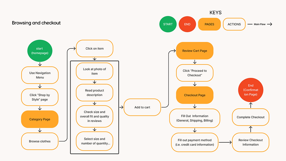
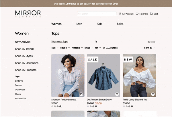
After analyzing direct competitors design patterns, I created a task flow of users browsing and checking out from cart using a similar process to ensure that users are familiar with the experiences. With these task flows, I started exploring some designs to bring the task flows to life. Few of the sketches can be viewed here.
TASK FLOWS
WHAT ARE SOME PATTERNS?


OTHER WORK
STYLE TILES FOR MIRROR'S BRANDING
Based on the user interviews, I made informed design decisions to improve the user's experiences on the homepage.
-
Information regarding shipping, delivery, payment methods, and store pick-up availability were provided on the homepage. Users shared that they would like to have this information readily available as opposed to knowing at checkout.
-
All items shown on hero section or ad photos can be redirected to specific detailed product pages when clicked on. This helps users find and buy items shown on photos easier.
-
Users can shop by style that they are interested in. Generally, users shop for items based on their preferred style.
-
The overall layout of the homepage is minimal and clean to avoid information overload. Users prefer shopping on sites that are clean and minimalistic design.
DESKTOP DESIGN
HOMEPAGE


Mobile Screens
Based on the user interviews, I made informed design decisions to improve the user's experiences on the checkout page.
-
The checkout process was simplified into four screens to avoid information overload. Users shared that the process can be too long in other websites.
-
Express checkout options and other payment methods were provided to encourage checkout completion. Users noted that they are more likely to complete checkout if express options are offered.
-
Order summary is available throughout the screen so that users feel confident that these are the items that they are purchasing.
-
As the user progress in the checkout process, they will see all the information they inputed each step of the way to increase their confidence that the information is correct.
DESKTOP DESIGN
CHECKOUT PAGE

Based on the user interviews, I made informed design decisions to improve the user's experiences on the detailed product page.
-
Users are informed shoppers, so the product descriptions provides enough information for users to read about the product.
-
Photos are very important to users, so the design ensures that photos have a large real estate on the page. In addition, close up view of the product materials are provided to show the materials.
-
The information bar regarding the quality of the product and how the sizes or fit the clothes are key elements to the design. It allows users to quickly make decisions on the quality of the product and what size to purchase without putting too much effort to read all customers’ reviews.
-
A carousel of item cards to suggest products that can be styles with. Users noted that they are interested in purchasing items to style with the product.
DESKTOP DESIGN
DETAILED PRODUCT PAGE

-
Continue iterating based on data collected from the usability testing.
-
Ideate and design experiences for other tasks, such as search features and filtering systems.
-
Retesting new designs and task flows with lower error rate and higher completion rate.
CONCLUSION
ACTION STEPS
Lessons Learned
-
Recruit early to have more users that reflects my user persona better, so they can participate in testing.
-
Consider moderating the next usability testing when time permits.
-
Design and implement more features for the prototype.
I conducted an unmoderated usability testing with 5 users who closely fit with my user persona. Users were given 4 scenarios with a given task. Prototype was a desktop version of the website. A full detailed report can be found here.
USABILITY TESTING
HOW DID THE USERS DO?
Scenario #1
There was 80% misclick rate on the homepage when asked to complete the task.
Users did not find it easy to complete the task because they were unsure where to click on the ads.
Scenario #2
100% of users were able to complete the task.
Users found this task to be easy to complete because the navigation menu and categories were easy to find and organized.
Scenario #3
Users spend an average of 30 seconds on the detailed product screen before adding the item to cart.
100% of users found the page provided enough information for them to make an informed decision without relying on reviews and sizing charts.
Scenario #4
The average time to review cart and complete the checkout process was 39 seconds, which 23 seconds were on the checkout pages itself.
All users stated that they would not mind completing the checkout process with this design if express checkout were not offered.
Scenario #1 Screen
Users had issues finding where to click on the ads to be redirect to the items shown, so I added an info icon next to the price and fixed the micro interaction with the tool tip so that it would disappear when the mouse was away.
IMPROVEMENTS
WHAT WERE SOME PRIORITY CHANGES?
Before

after

Scenario #3 SCreen
I moved the reviews link in the product description section so that it is grouped with the True to Size and Quality of Product range. This will make it easier for user to use the information bar first before putting effort to read reviews.
Before

after

read other case studies
Enrich
End to End Application, UX/UI, Interaction Design
Improving Users' Ability to Maintain Routines By Gamifying Motivations
Netflix
Add a Feature, UX/UI, Interaction Design
Increasing Customer Engagement on Netflix to Improve Customer Retention
JustBc
Responsive Web Design, UX/UI, Freelance
Improving the Order Process from Instagram's Direct Message to E-Commerce Website


